Why modern screens show different colours to different eyes
A UCL-led study found the gap is widest in blue tones for older viewers, and in red and green tones for people with common genetic variations in colour vision.
Scientists at University College London (UCL) have built a computer model explaining why the same picture on a screen can look like a different colour to different people.
Television, smartphone and cinema screens have moved from older, broad light sources to narrow ones such as quantum dots and lasers, widening the range of colours they can produce.
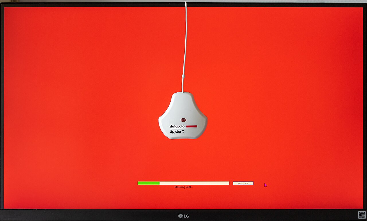
That shift has brought an unintended side effect: two screens that each measure as perfectly calibrated can still look mismatched side by side. A film director grading a scene on a mastering monitor might see a subtle teal sky, while a viewer watching the same film on a calibrated home television sees an over-saturated cyan, the researchers said.
The mismatch, known as observer metamerism, happens because people’s eyes differ physically from each other, even when their colour vision is considered normal, according to the study.
The team, led by Andy Rider, a vision scientist at UCL’s Institute of Ophthalmology, built a model that accounts for two sources of that difference: the mix of light-sensing cone cells in a person’s retina, and the way the eye’s lens yellows with age and filters out more blue light.
Rider and the team tested the model — which also accounts for deuteranomaly, a shift in green-light sensitivity affecting about one in 20 males — against 16 real screens, including OLED and LED televisions, mastering monitors and cinema projectors. Blue caused the biggest gap between younger and older viewers, the study found, while red and green caused the biggest gap for people with cone-cell variations such as deuteranomaly.
“The people who produce films and TV shows want their work to look the same whatever device it is being viewed on, which is complicated by differences in people’s color vision and outdated calibration methods,” Rider said.
The model, Rider added, “can be used to determine how best to adjust the three primary colors of a specific display to provide the best viewing experience for as many people as possible.”
The study, carried out with co-authors John Frith and Andrew Stockman, also at UCL, was published in the journal Optics Express on 22 September.
Calibration tools used across the television, smartphone and cinema industries rely on colour-matching standards set nearly a century ago, which the team said do not reflect real human eyes. Physical tests with human volunteers, they added, are still needed to check the model’s predictions.
The same approach could help with other colour mismatches too, such as LED lighting versus older bulbs, or dyes and pigments, Rider said. Screen makers could use the model to design displays with four or five colour channels instead of three, so pictures look more alike across viewers, the team said.